Blog
/
Ecosystem Components
Building a white-labeled Lit Component Library
White-labeled Lit components designed to be integrated into the inlang ecosystem. These components operate across various tech stacks, making them a universal solution for building apps quickly and with good UX.
Topic
Web Components
Published
Juli 2024
Reading time
4 min
Intro
Building a component system across an ecosystem of apps is a nightmare!
- Different stacks
- Diverse design guidelines
- Numerous stakeholders
In this post, I want to provide a quick overview of how I resolved the issue with universal Lit components that can be utilized across the inlang app ecosystem. Throughout the process, I will also share insights and findings so that you can apply some of them to your projects.
The Requirements
- Easy-to-use components with great UX
- Needs to run in different frontend stacks (Solid.js, React, VSCode, …)
- The components need to adapt to existing design guidelines
- It needs to be built quickly. Use stuff that is already there to roll out faster (because we are a startup)
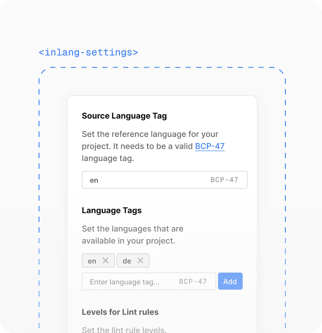
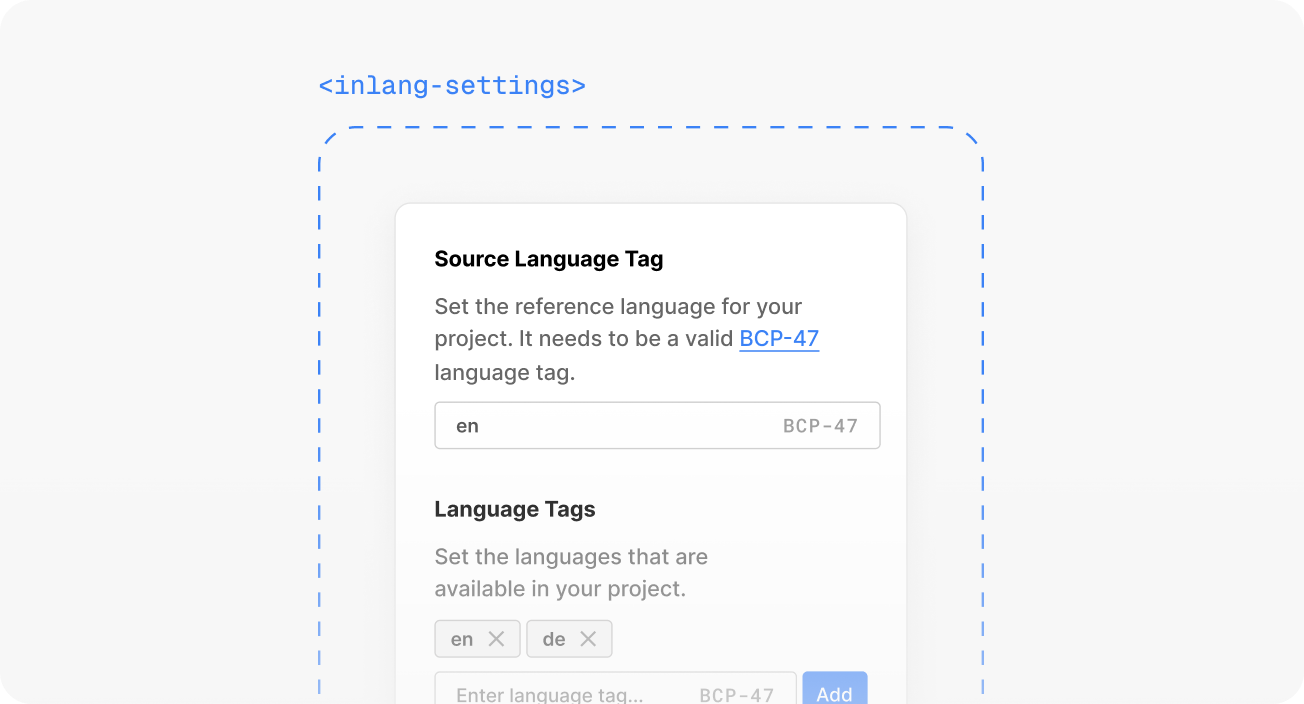
I will use the <inlang-settings-component> to provide a more concrete example to guide you through my process.
The Solution: White-Labeled Lit Components
After a brief research, it became clear that we require UI components that can be rendered in any web interface. For instance, the settings component needs to operate in the following interfaces:
- Sherlock — A VSCode extension that helps you extract translations from code
- Fink — A Solid.js translation management app (will be React in the future)
- Parrot — A Figma plugin that allows you to swap languages in your design
I quickly settled on Lit web components. It checked some key points:
- Built on web standards → web components
- Maintained by Google (pretty enterprise, so they won't drop it)
- Shadow DOM with encapsulated styling and slots (makes it pretty flexible)
- Can be rendered in almost any web scenario (SSR is a bit of a hack, but was not in scope)
To avoid starting from scratch, I decided to use Shoelace as a base layer for the UI. Shoelace received a large crowdfunding campaign, so it should be maintained for a long time. One advantage is that we can customize Shoelace components using custom CSS properties and the part API. This way, we can ensure that apps can style the components as they wish and that the components won't feel out of place.
→ Alright, we can create stylable Lit components to render in any web interface. Additionally, we can leverage a UI library to expedite the rollout.
Integration with the inlang Ecosystem
The inlang ecosystem provides apps with an SDK for managing data access. For instance, the settings component can retrieve settings and receive them in JSON format. These components are built to manage serializable properties, which means they can also be used in plain HTML.
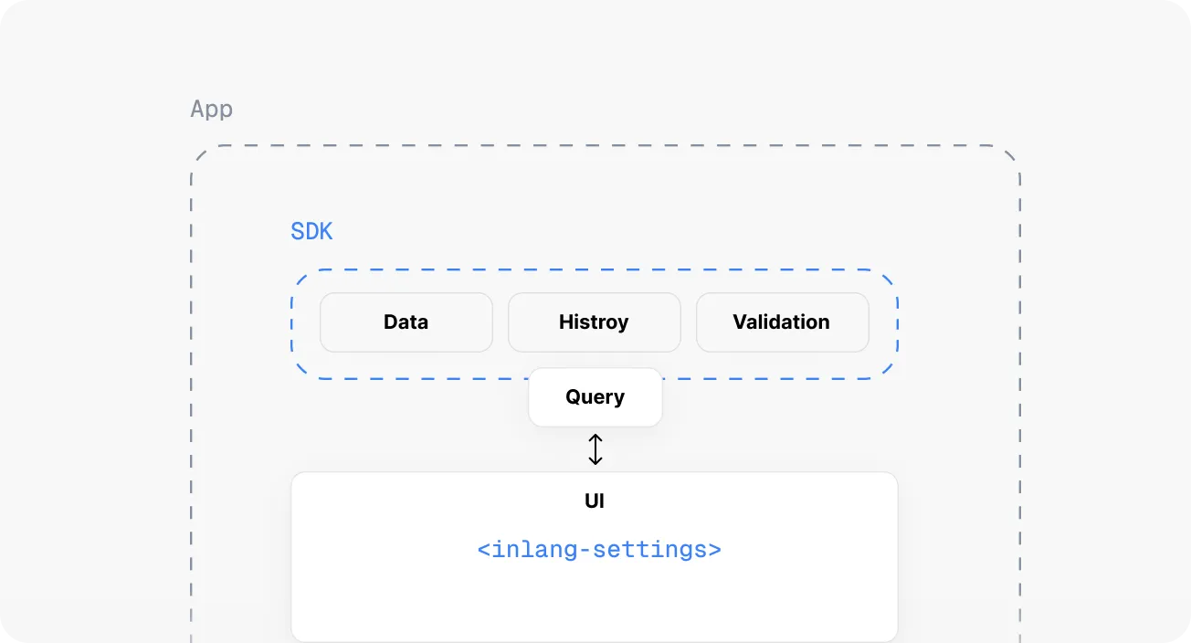
This keeps all kinds of query logic out of the components. The mental model of a component is simply to receive a JSON, edit the data, and dispatch an event with the new JSON. The component gets the settings JSON as a prop or attribute (depending on the stack) and rerenders on change.
html<!-- index.html --> <inlang-settings settings={settings} > </inlang-settings> <script> const element = document.querySelector('inlang-settings'); element.addEventListener("setting-changed", function(newSettings) { alert(newSettings); }); </script>
To theme the component UI, you can partially use the Shoelace custom CSS properties or access the part API of the Shoelace components. The app developer simply needs to override the properties and — custom theming is achieved.
css/* style.css */ inlang-settings { --inlang-color-primary: "#0BA5E9"; --sl-input-background-color: "#FFFFFF"; --sl-input-color: "#000000"; }
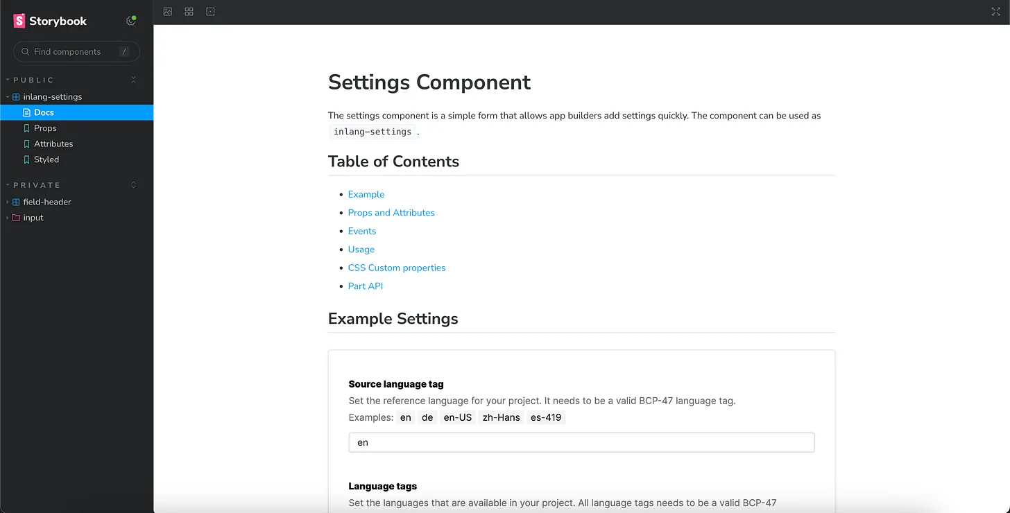
For development, I used Storybook. This enables you to build the components in isolation and allows writing neat documentation explaining how to use the components.
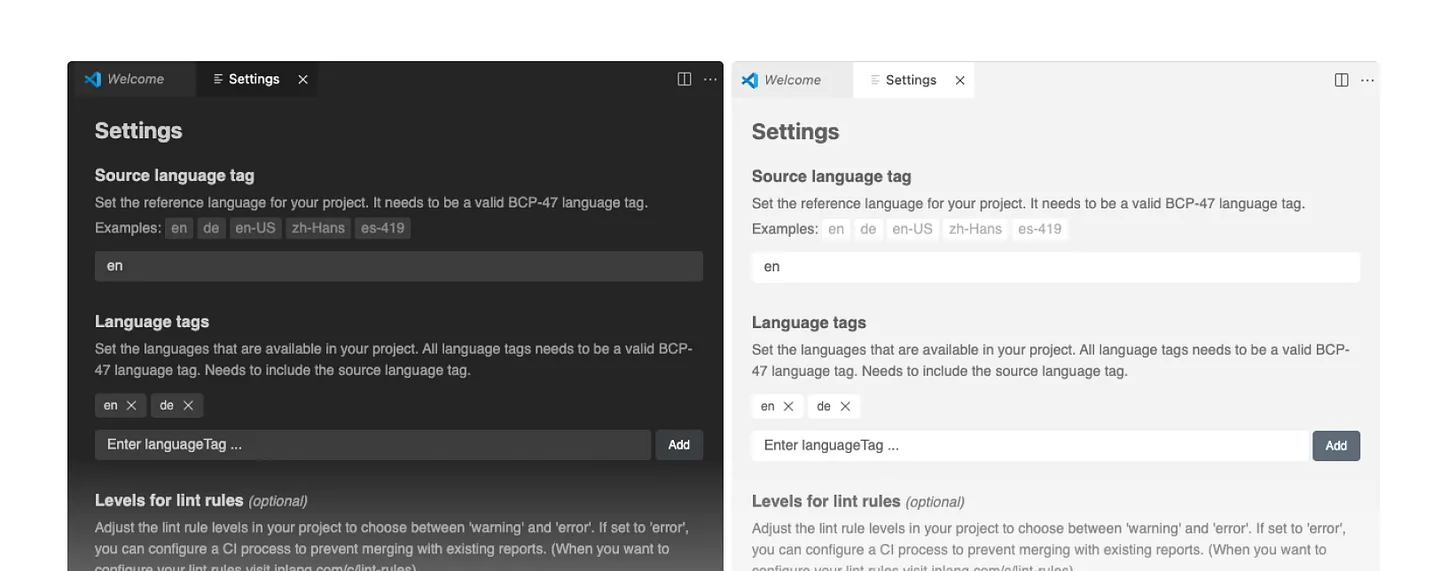
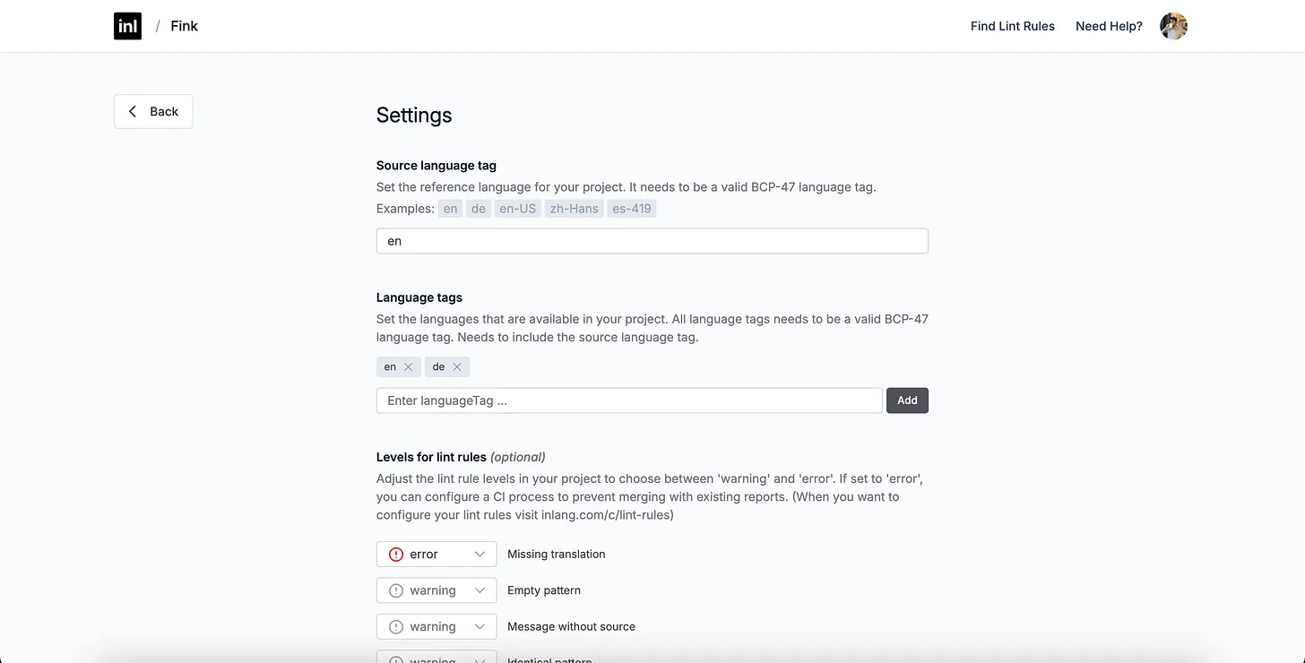
The component in action
The following images show the settings component in the VSCode extension together with different VSCode themes.
Limits of Lit Elements
Rich Text Editors
A big bummer was when I realized that the Selection API in Shadow DOM is not yet standard in all browsers, making it nearly impossible to create advanced text editors. Luckily, the Lit element architecture was flexible enough to slot a contenteditable element into the component. This allowed it to be placed in the light DOM, where it functioned properly. To ensure it still had a good API, I wrapped the component in a Lit element with a disabled shadow root, where I did the needed wiring.
Only Molecular Components
As you might have noticed, the current component system does not deal with atomic components of a design system (buttons, input fields, etc.). All of these elements are Shoelace components. Additionally, the theme API comes from Shoelace, which makes it somewhat odd to use an inlang component with some Shoelace CSS properties. We also have to customize a Shoelace button in every component, which is quite inefficient. However, I decided not to create an atomic layer to avoid being delayed by rebuilding the Shoelace library.
→ As mentioned, speed and delivering value are essential priorities in a startup.